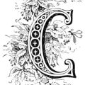
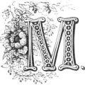
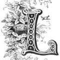
I so love these old print foundry letters. While fonts do make it far easier to change the size of the letters, they just don’t have the artistry these drop cap engravings do.
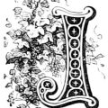
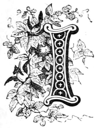
This pretty letter I engraving was used in an 1867 French work that compared fashionable ladies to flowers – with and without their thorns. The ladies appear on many other websites, but, pretty much everyone ignored all of the other wonderful graphics that were used in between.
The publisher used 13 letters of the set and you can find all of them here – French Print Foundry Alphabet. Like all of the letters, this letter I is decorated with a series of circles and crosses. And like all of the other letters, this one too is decorated with flowers and vines. I’m not entirely sure though if there’s not also 2 birds hidden among the leaves or those areas are just parts of a flower. I’ll leave it to you to decide if they’re flowers or birds.
This image is copyright free and in the public domain anywhere that extends copyrights 70 years after death or at least 120 years after publication when the original illustrator is unknown.
